This blog is for my Alevel media studies. It will feature work and research which will contribute to my course.
Saturday, 21 February 2015
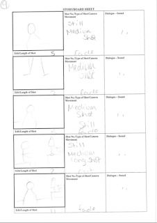
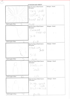
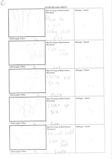
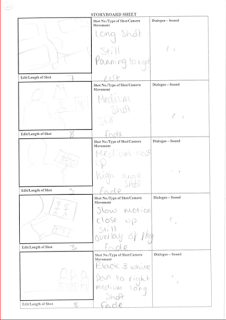
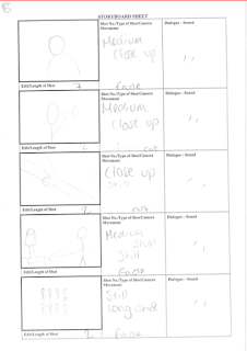
More story boards
Here are a few of the story boards myself and Alex have been working on. They are very basic and rough but I'm not artist and Alex is only doing textiles (insert humour). They show a clear and brief outline of what our project will begin to look like.
Friday, 13 February 2015
Sunday, 8 February 2015
Poster step by step
When starting my poster I used Photoshop. These are the custom dimensions for my poster:
On the left hand side of Photoshop there's this tool section which allows me to manipulate the project. The top tool which is selected is the cursor tool which allows me to select any of the items on my document without altering them. For example, it moves them around and lets me resize them.
- The rest of the tools allow me to crop, change the colour the item on the page...etc.
- One of the tools which allowed me to get the background for my poster is the 6th tool down from the top. I used one the badges on his uniform which was a light greeny colour in the light. Selecting the bucket tool, I then put the colour onto my background.This is the tool selection area
which allows me to manipulate and
alter my picture according to my - (Click on this to get a better and larger image)
choices. As you can see, these are the tabs that are
open. This means that I have went to 'file',
- A lot of them allow me to change 'open', and selected the image I wanted. To
the colour, shape, size, transparency; then get it in my open Photoshop document I
basically anything. have to press 'ctrl' and 'a' which selects the
whole image, then I can press 'ctrl' + 'c' which
copies whatever is selected. 'Ctrl' and 'v' then
pastes whatever you have selected. These are
just the shortcuts which make it fast and easy
when editing.
This is what the blank canvas looks like once I have went onto custom and changed the setting to transparency. I do this
because it makes it easier when I have a white or
coloured background.
This is because the squares
make it easier to see what colour
hasn't been rubbed out...etc.
I coloured in the background white.
I inserted a picture of George which was
a full bodied picture. I wanted to make it
like those old war photos so tried playing
around with it and cut off some of his body.
Personally, I believe it looks rather professional
and if I had a nice sepia effect on it then it would
definitely look like a war photo.
This isn't exactly an ideal image. Not
that it isn't a good pose/angle, it's just
not a good edit. I was just playing around
to see what colour i preferred and what angles, but
i can definitely say that i don't like it.
It looks too:
- faded
- white
- dreamlike
- transparent
The dreamlike thing would work however it just doesn't feel like it fits with the theme of what I'm trying to achieve.
Monday, 2 February 2015
'Hawthorne Care home'
On some older posts we have discussed the possibility of using a care home for our media project. We emailed hawthorne but have yet to receive information with regards to them accepting us to use their facilities. With this in mind, we have decided to move the filming to my house. I have a very blank bedroom at the moment since i haven't decorated and i could just move all the stuff out the room so theres just a bed and it is basically a blank canvas.
This clearly isn't my room but it gives an idea of what it will look like.
OCR response
On the previous post it states that we emailed the OCR with regards to our A level media project and found images. We knew that a couple of seconds of found footage can be used in general but we were unsure what were the regulations when it came to images. Here are a couple of screen shots with their response. I believe i found it very useful and can help anyone who was in the same situation.
Screenshot 1:
Screenshot 3:
This made it clear that were able to use other resources to help assist our media project however if we didn't take the pictures then we can't take credit for them. I believe that is totally reasonable and the only reason we needed to use a picture is because there is no where or no way we could take a picture of an authentic WW2 aircraft and make it look decent enough to put on our blog/posters.
Screenshot 1:
Screenshot 2:
Screenshot 3:
This made it clear that were able to use other resources to help assist our media project however if we didn't take the pictures then we can't take credit for them. I believe that is totally reasonable and the only reason we needed to use a picture is because there is no where or no way we could take a picture of an authentic WW2 aircraft and make it look decent enough to put on our blog/posters.
Poster Ideas and poster so far
Here are some images of my poster so far. These are potentially going to be the main image on my poster.
Sunday, 1 February 2015
This is a flatplan of my poster. I was looking at all the war posters and other posters I researched, and decided to create a small design of what I might want my poster to look like. It isn't overly detailed but then again, I might go for the minimalistic looks after looking at all of these posters.
Subscribe to:
Posts (Atom)