In what way does your media product use, develop or challenge the forms and conventions of real media products?
Notes of ancillary:
Notes of ancillary:
 - Poster of the short film I am creating
- Me and Alex used a found image because we were unable to get an actual primary picture of an aircraft vehicle from WW2. I was able to find a nice old picture from Google images and then altered it accordingly to fit with the theme of the poster. It adds a feel of authenticity and creates the style I'm aiming for.
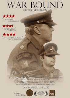
- My poster if very minimalistic. The plane at the bottom ties in all the images, showing a connection between all the memories.
- The colours of these three main images and edits resemble a dream-like state which supports the theme that runs through my short.
- Similarly, myself and Alex both used a larger side image for our main protagonist as it draws attention to his features and the concentration on his face. This image has connotations of a lost man, split by the two worlds he lives in. Present day where he is tormented by his past and the past which is riddled with haunted images of his past life and the events that have scared him
- Large, plain, clear title is clear to see and reinforces the old fashioned look
- All the images are in sepia - and effect that was achieved by using photoshop. This creates a WW2 feel as a lot of the old war photos of soldiers were taken is this old coloured style.
- The blending of the images into one another show how the memories weave within between each other, connected and central to the main protag.
- 'George Morrison' is the main character in the short film. His name is featured under the title and is central in relation to everything on the page because he has a significant amount of importance to this short film project and it also shows who is starring within it.
- Like a lot of credits, they normal feature at the bottom of the page on a poster. They feature a lot of information like who's in the film, directors, producers..etc. The majority of the writing is in a smaller font which allows a lot of the focus move to the images however, the more important information is in a larger font. The names are in the larger font.
- There are now socialnetworking sites and websites which allow the consumer to interact with the film..etc. This is also a form of synergy. Two organisations coming together to promote one product, E.g, this film.
- The costumes clearly portray the time period it's set in and adds to the poster.
- Quotes on the poster emphasise that this is an amazingly well-received short film.
No comments:
Post a Comment