This blog is for my Alevel media studies. It will feature work and research which will contribute to my course.
Sunday, 3 May 2015
Friday, 1 May 2015
Thursday, 30 April 2015
Wednesday, 29 April 2015
Tuesday, 28 April 2015
Question 3 - What have you learned from your audience feedback?
These are the
questions I asked.
I didn't stick to the questions word for word but used them as a platform to base what I was saying off. This was because I didn't want it to be extremely formal as I wanted them to give me a relaxed and honest answer. Also, I did know these people and I didn't want intimidate them with what I was going to ask them.
I didn't stick to the questions word for word but used them as a platform to base what I was saying off. This was because I didn't want it to be extremely formal as I wanted them to give me a relaxed and honest answer. Also, I did know these people and I didn't want intimidate them with what I was going to ask them.
- Some problems I thought about after I recorded them:
- These problems didn't really matter in the end because they gave me honest answer and I trusted their judgement and not to be bias
- I was worried they would try and be nicer and not be as harsh but they were amazing, and even though they weren't thrilled about being recorded, they wanted to help with my project.
Open questions I asked for my audience response:
- Did you enjoy my short film?
- Did you dislike anything about it?
- What did you think of the flashbacks?
- Is there anything you didn't understand?
- Did you feel like the music was appropriate?
- What type of atmosphere did you believe the music created?
- What genre would you categorise this film into?
- Because you mentioned one genre, there are many sub genres present and my shorts falls under some of them. What sub-genres did you categorise my short into?
- I learned from this that the music is crucial. A lot of the audience asked what other music I had or I had considered when I asked them the question about music. I showed them one other possible choice for the music but they then decided that the music I selected was better suited.
- One said and I quote "Music makes a difference, when you alter It even slightly It affects the mood and balance of the film".
- I showed the audience drafts in the past and kept asking my class mates what they thought of my ancillary tasks. I believe it's always best to get a better second opinion because someone with fresh eyes are witnessing it for the first time.
- Within the short film, some had commented on the length of some of the shots and that it could be extended. To begin with, me and Alex cut down a lot of the shots so there would be room for more. Although it is a short film and we have a max of 5 mins we rushed into it and had time to spare. Once we realised that, we lengthened the shots and this pleased the audience because they were able to enjoy the film at their own leisure.
Pie charts
Here are a couple of pie charts that support the audience feedback I received. The first one was ' What was your favourite part of the film'. I gave a selection of things which allows me to see what they actually liked. It shows that the flashbacks were a huge hit with the audience which is fantastic because they are the shots that worried us the most because we didn't know if they would grasp the fact that they are flashbacks from the past.
This response is to the age question. It shows that out of 100, the majority were females. Im not sure if this is because of the people I asked but it shows that more females would watch this film. Im not sure if I should be pleased with this result because I expected it to be a more male dominated audience but this proves that I shouldn't expect and conform to the stereotypical views of who sees what film since society is constantly evolving opinions and ideals change regularly.
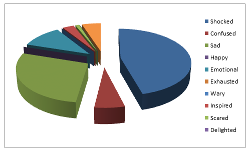
This is the response to how did they feel when watching the film. I am overall pleased with this because it shows that they were shocked and responded well to our expectations of the film.
This is the rating of the film. Because it stays in the top end of the scale it shows that it was a popular film and I'm glad that the 100 people who watched it enjoyed it.
This is a closed questionnaire.
I asked a group of people these questions and their response allowed me to go back and make some changes.
For example: This is an audience who are watching my short film for the first time (I have worked on it from the beginning, so it's great to get a new perspective)
One questionnaire said it was hard to follow so I went back and made it smoother - I worked out what clips should go where in order for the story to be more clear.
In addition to this: when they responded to how they felt about the film, the majority circled the sad and rather emotional sections which was great because that is what we were aiming for.
question 3 - Audience response: What have I learned from my audience feedback?
Although me and Alex worked together for the actual production side of our coursework - The short film, we obviously did the ancillary work individually and the evaluation.
Talking to Alex, she did a video response and I would have done the same however I was unable to get the people i wanted on the camera. They didn't want to be recorded but were still willing to have an audio recording since their faces weren't in it.
Who participated: 2 females.
Did i find these responses useful?
Yes, Although the questions i asked weren't complex, they were able to develop their questions so they would be able to help me with this evaluation. They discussed what they enjoyed and what could have been improved. Overall, a good experience to hear two people who haven't been working on this project give their comment.
Monday, 27 April 2015
Sunday, 26 April 2015
Evaluation: Question 1
In what way does your media product use, develop or challenge the forms and conventions of real media products?
Notes of ancillary:
Notes of ancillary:
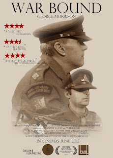
- Me and Alex used a found image because we were unable to get an actual primary picture of an aircraft vehicle from WW2. I was able to find a nice old picture from Google images and then altered it accordingly to fit with the theme of the poster. It adds a feel of authenticity and creates the style I'm aiming for.
- My poster if very minimalistic. The plane at the bottom ties in all the images, showing a connection between all the memories.
- The colours of these three main images and edits resemble a dream-like state which supports the theme that runs through my short.
- Similarly, myself and Alex both used a larger side image for our main protagonist as it draws attention to his features and the concentration on his face. This image has connotations of a lost man, split by the two worlds he lives in. Present day where he is tormented by his past and the past which is riddled with haunted images of his past life and the events that have scared him
- Large, plain, clear title is clear to see and reinforces the old fashioned look
- All the images are in sepia - and effect that was achieved by using photoshop. This creates a WW2 feel as a lot of the old war photos of soldiers were taken is this old coloured style.
- The blending of the images into one another show how the memories weave within between each other, connected and central to the main protag.
- 'George Morrison' is the main character in the short film. His name is featured under the title and is central in relation to everything on the page because he has a significant amount of importance to this short film project and it also shows who is starring within it.
- Like a lot of credits, they normal feature at the bottom of the page on a poster. They feature a lot of information like who's in the film, directors, producers..etc. The majority of the writing is in a smaller font which allows a lot of the focus move to the images however, the more important information is in a larger font. The names are in the larger font.
- There are now socialnetworking sites and websites which allow the consumer to interact with the film..etc. This is also a form of synergy. Two organisations coming together to promote one product, E.g, this film.
- The costumes clearly portray the time period it's set in and adds to the poster.
- Quotes on the poster emphasise that this is an amazingly well-received short film.
Sunday, 19 April 2015
Coming up with the title for the poster
Me and Alex were sat for ages trying to come up with names that didn't sound ridiculous or silly. (It was very hard) A lot of them sounded very cheesy and made the short film sound childish and cringe worthy.
A lot of the names had been taken in general by other movies.
We had ones like:
- The journey
- Barricade
- Counter March
- Fallout
- The ground strikes
- As she falls
- In my dreams.
We thought of the story in our short film and decided on 'WarBound'.
It's simple and says what it is really. No need to explain any more.
It's about a man trapped in an eternal war between himself and the battle he faced fighting for his country.
Actors used
The actors I have used are:
-George
-Alfie
-Julia (My mam)
and Brian.
These are all because i know them, can rely on them and because they are close by.
This is just an update saying that we have all our actors and that filming is going well. Really well in fact. Because it's a short film, a lot of the work is concentrated and heavily focussed as we have a short time space. This means we have tog et everything done and finished almost the same day we start the recording. This will prove to be a challenging task but i'm sure with the help of my partner and the amazing actors i'll be able to get it done.
What my article/review is based on. (Image of 2 page article)
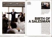
These are some of the magazine articles that inspired me. They are all from the same magazine, 'Sight and Sounds'. You can see this through their simple and minimalistic layout. I like how they aren't cluttered and filled with a lot of distracting information and pictures.
This is what my article is actually based off. It was difficult actually getting the font the same. I don't think i used the same one but something similar. all the things i did change worked to my advantage as i used them to improve what they already had, and i adapted it to my own personal tastes.
I was confused when i looked at this. The first thought i have when i look at an article is "Wow, this is a lot". I was unable to comprehend how something this basic was able to get into the magazine. On the other hand, those that want quick, precise information without all of the flashing garbage that you normally see in articles, this is great.
Friday, 17 April 2015
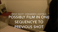
Screen shots of what i need to change in the film
Here are some screenshots of what I . need to reshoot or change. When I originally went to shoot with George, It was just myself, my mam and him. He isn't an actor but took direction really well. Well, when i say that he was hard work!!! He got easily distracted which would be expected when you ask someone to do like 15 takes of the same shot!!!
- If we were to film again, would be easier if Alex could be there so we could film at the same time, allowing us to get the same exact shot/dialogue but at different angle. Would also speed up the process.
- When looking at the footage on IMovie, you can tell that the footage in the dark isn't as clear as the ones in the light. It would be desirable for the footage not to pixelise because of how dark it is but to keep the same darkness and clarity.
- The door is open and the previous shot it isn't.
- Will have to change this but if we don't have time it isn't too obvious.
- I love this gentle high angled pan to the left
- It was a nice angle which has connotations of inferiority and vulnerability
- I'm not sure if it looked too shaky in the beginning of the clip though.
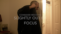
- There wasn't anything particularly wrong with this shot
- Just out of focus
- Could use it if i can't redo the shots.
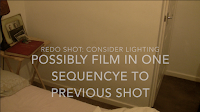
- This sequence is when George comes to the left
- It's a high angle, left pan
- Bit shaky
- Could do with another take
- Static shot
- Could do with a diff angle
- Maybe his face in it?
- I had to speed this clip because it didn't seem to urgent
- Needed it to seem realistic
- Redo if possible // I like the lighting.
- Good shot
- If the actor could - get him to redo it
- Needs to look more natural but at the end of the day he isn't an actor
- The rocking seems too fake
- Need to get it to look less solid and more fluid like he is actually scared
- This shot is with my mam
- Dialogue is on the top
- Will work but the rocking is still too hard
Sunday, 15 March 2015
Significant props used
We used these props within our short film. Alex got them from her grandfather who was amazing help when we needed authentic props. It wasn't necessary for us to get 'authentic' items however we thought it created a real element to the film. These pictures below are actually of Alex's grandfather in the artillery. It's amazing looking and working with these items, feels like we're actually working with history. Makes what we're making seem more important.
Friday, 6 March 2015
What I need to do to round this off.
When I was looking at this as a JPEG then on Photoshop, I realised I need to re-align everything so they are perfect and centred or in my case actually in line with each other. I'm not sure about the name 'George Morrison'. I feel like it should be slightly smaller but I showed this to 5 members of my class and one said they didn't like it where as the other four who were sitting close by suggested that I should keep it because it makes the title stand out.
- The stars need to be repositioned so they're together
- The font might have to change at the bottom of the page so it looks more like a movie poster. If not, it looks lovely (just me being picky)
- The 'in cinemas june' must be in line with the central images and the promoters at the bottom of the page.
- when I put the rules back on I'll make sure that the promoters/companies are in line
- The lines on the poster / on the actors could be slightly blurred so they don't look so harsh.
Tuesday, 3 March 2015
Mistakes
During the course of our filming, we've edited along the way slipping clips into little places to eventually make up 'War Bound'. The problem we have encountered a few times is that some of the shots we would have loved to have used weren't ideal and had to cut them out. Above this is a small video with 'Shot 1' onwards on it. I will reference the video and explain why they weren't suitable for the film.
Saturday, 21 February 2015
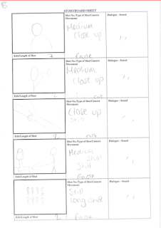
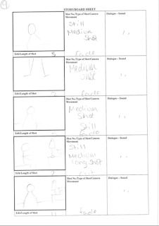
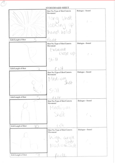
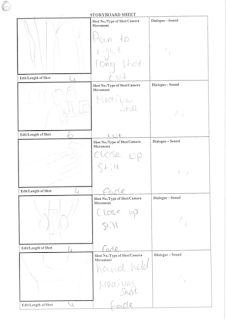
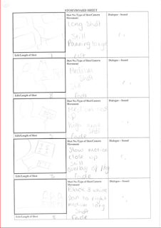
More story boards
Friday, 13 February 2015
Sunday, 8 February 2015
Poster step by step
When starting my poster I used Photoshop. These are the custom dimensions for my poster:
On the left hand side of Photoshop there's this tool section which allows me to manipulate the project. The top tool which is selected is the cursor tool which allows me to select any of the items on my document without altering them. For example, it moves them around and lets me resize them.
- The rest of the tools allow me to crop, change the colour the item on the page...etc.
- One of the tools which allowed me to get the background for my poster is the 6th tool down from the top. I used one the badges on his uniform which was a light greeny colour in the light. Selecting the bucket tool, I then put the colour onto my background.This is the tool selection area
which allows me to manipulate and
alter my picture according to my - (Click on this to get a better and larger image)
choices. As you can see, these are the tabs that are
open. This means that I have went to 'file',
- A lot of them allow me to change 'open', and selected the image I wanted. To
the colour, shape, size, transparency; then get it in my open Photoshop document I
basically anything. have to press 'ctrl' and 'a' which selects the
whole image, then I can press 'ctrl' + 'c' which
copies whatever is selected. 'Ctrl' and 'v' then
pastes whatever you have selected. These are
just the shortcuts which make it fast and easy
when editing.

This is what the blank canvas looks like once I have went onto custom and changed the setting to transparency. I do this
because it makes it easier when I have a white or
coloured background.
This is because the squares
make it easier to see what colour
hasn't been rubbed out...etc.
I coloured in the background white.
I inserted a picture of George which was
a full bodied picture. I wanted to make it
like those old war photos so tried playing
around with it and cut off some of his body.
Personally, I believe it looks rather professional
and if I had a nice sepia effect on it then it would
definitely look like a war photo.

This isn't exactly an ideal image. Not
that it isn't a good pose/angle, it's just
not a good edit. I was just playing around
to see what colour i preferred and what angles, but
i can definitely say that i don't like it.
It looks too:
- faded
- white
- dreamlike
- transparent
The dreamlike thing would work however it just doesn't feel like it fits with the theme of what I'm trying to achieve.
Monday, 2 February 2015
'Hawthorne Care home'
On some older posts we have discussed the possibility of using a care home for our media project. We emailed hawthorne but have yet to receive information with regards to them accepting us to use their facilities. With this in mind, we have decided to move the filming to my house. I have a very blank bedroom at the moment since i haven't decorated and i could just move all the stuff out the room so theres just a bed and it is basically a blank canvas.
This clearly isn't my room but it gives an idea of what it will look like.
OCR response
On the previous post it states that we emailed the OCR with regards to our A level media project and found images. We knew that a couple of seconds of found footage can be used in general but we were unsure what were the regulations when it came to images. Here are a couple of screen shots with their response. I believe i found it very useful and can help anyone who was in the same situation.
Screenshot 1:
Screenshot 3:
This made it clear that were able to use other resources to help assist our media project however if we didn't take the pictures then we can't take credit for them. I believe that is totally reasonable and the only reason we needed to use a picture is because there is no where or no way we could take a picture of an authentic WW2 aircraft and make it look decent enough to put on our blog/posters.
Screenshot 1:
Screenshot 2:
Screenshot 3:
This made it clear that were able to use other resources to help assist our media project however if we didn't take the pictures then we can't take credit for them. I believe that is totally reasonable and the only reason we needed to use a picture is because there is no where or no way we could take a picture of an authentic WW2 aircraft and make it look decent enough to put on our blog/posters.
Poster Ideas and poster so far
Here are some images of my poster so far. These are potentially going to be the main image on my poster.
Subscribe to:
Posts (Atom)


