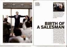
These are some of the magazine articles that inspired me. They are all from the same magazine, 'Sight and Sounds'. You can see this through their simple and minimalistic layout. I like how they aren't cluttered and filled with a lot of distracting information and pictures.
This is what my article is actually based off. It was difficult actually getting the font the same. I don't think i used the same one but something similar. all the things i did change worked to my advantage as i used them to improve what they already had, and i adapted it to my own personal tastes.
I was confused when i looked at this. The first thought i have when i look at an article is "Wow, this is a lot". I was unable to comprehend how something this basic was able to get into the magazine. On the other hand, those that want quick, precise information without all of the flashing garbage that you normally see in articles, this is great.


No comments:
Post a Comment